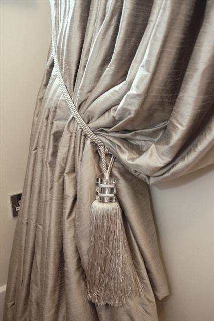
Guide from Dunelum How to Measure for Curtains

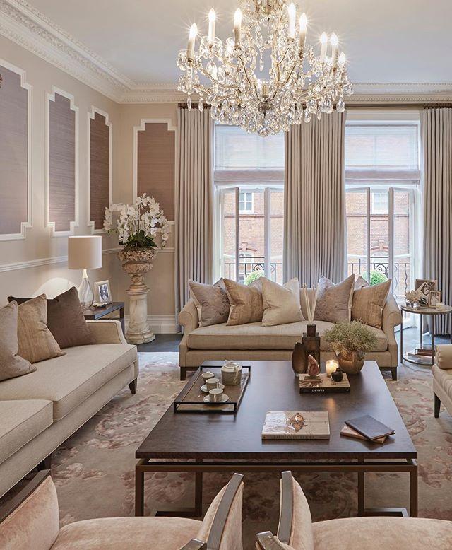
A room is never finished without furnishing the windows, once they are complete the warmth and softness of finishing touches can be noticed.

Many companies now require us to measure our own windows, Finished found this super guide from Dunelm to help us

Share This Article

WOULD YOU LIKE TO SEE YOUR HOUSE FEATURED ON FINISHED.IE?

Please click on the button bellow and fill the Featured House submission form.

Guide to Crittall?

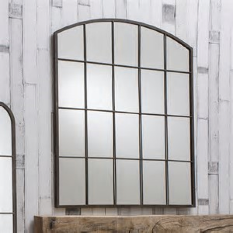
With the ‘on trend’ Crittal interest reaching new heights across Ireland, we set the FINISHED.ie team the task of bringing you a little addition for your home to embrace this trend. So we started searching across Ireland for the perfect Crittal Mirror.

In fact, Crittal is far from new, but rather the first steel windows were manufactured by Francis Hentry Crittall in the 1880’s. However we are seeing a great resurgence and we at FINISHED.ie are loving this style and want to embrace it.

So what was the result of our search?

The usual reliable stores are on top of this trend all stock Crittal Mirrors, Next Home’s ‘Silver Squares Mirror’ €201 and Laura Ashley’s Malory Mirror, both available instore and online through their catalog shopping.

This journey did bring us upon, Interiosity, a fabulous interiors store in Cork which has a great range of Crittal Mirrors. Interosity began as a collaborative effort between Nicole McGee and Caroline Breen – two interior designers from Cork whom create beautiful and personalized homes. The 9 Panel Metal Mirror (118cm wide 118 cm high) retails at €295, and they tell us there is a 6 panel version.

But it was Rowell Design, Donnybrook that we fell in love with the xtra large ‘Garden Mirror’ although they display it outside with the Garden collection this Mirror is equally fabulous indoors and really manages to deliver a WOW factor. Tip: to create a statement wall, for example in a hallway try putting two together. The impact is really large space creation and to finish the trend maybe opt for a metal console table too?

Share This Article

WOULD YOU LIKE TO SEE YOUR HOUSE FEATURED ON FINISHED.IE?

Please click on the button bellow and fill the Featured House submission form.

Animal lovers the world over: here are some clever ways to incorporate your pet’s bed into the finish of your stylish home.

The only thing you should remember when making any solid pet beds is that the size has to be right. It’s hard to get a German shepherd to fit into the space meant for a chihuahua, and no amount of explanation or remonstration will help them feel more comfortable.

Remember, measure, observe your pet’s behaviour when they are in bed, and try to make a bed they can really love.

1. Built in dog crates for your kitchen and living room

Dogs are den creatures, and this means they often feel most safe and secure when they’re tucked away inside four close walls with a little roof over their heads. For this reason, many dog experts recommend crate training for your pooch. It can seem strange to humans who dread the idea of being trapped in a cage, but the added safety felt by the dog increases their self-confidence and reduces anxiety.

However, crates are often huge! Even for a relatively small dog, the volume of a dog crate has to be taken into account, as it is deep, tall, and long.

So what can you do?

One of the nicest trends in home interiors for pets right now is the built-in dog crate. Fitted under a table, or beneath the breakfast bar or other counter tops in the kitchen, you can incorporate the same look like the rest of the room, without compromising your dog’s safety, security, and comfort.

If your dog prefers creature comforts, the living room can also provide some great spaces. Perhaps you have an empty corner of the room that needs filling or a space that could take an adapted table top with a crate built in below. Vintage dressers often come with a large space beneath, and these are relatively easy to adapt if you have some joinery skills and a smallish dog. Old-style writing desks can also be perfectly adapted for cats and small dogs.

2. Handy table den beds

Not all homes have the same amount of available space, so adding more furniture for the sake of disguising a pet bed may not work for you. For this reason a den bed under an already useful table or desk can be a perfect spot for sleeping. With the roof over their heads, and perhaps a curtain or two around the outside, they’ll still feel safe, but there’s space for them to stretch out and really make the most of their little room.

It doesn’t have to be the dining table. Many people have side or end tables next to their sofa, so giving these a dual purpose could be the answer. Let’s face it, most pets like to be in on the action, so having their bed in the same room where everyone else relaxes is usually the answer to pet bed location problems.

3. Under-table cat hammocks

Cats, as most of us know, are not inclined to sleep where they’re supposed to. Get them a new bed, and they’re just as likely to spend the next year lounging in the cardboard box it came in.

However, if you think your moggy could be purr-suaded to take up residence in a specially designed cat hammock, these are so easy to create, you’ll be laughing. You can make these on stools, side tables, or even under the dining table. In fact, as long as there are four legs to which you can attach the corners, you’re laughing. Velcro is your friend.

4. DIY pallet beds for dogs and cats

If you’re handy with a hammer, saw, and a bag of nails, you might like to re-purpose one of those ubiquitous wooden delivery pallets. Although these lend themselves to the raw, reclaimed wood look, they can also be sanded, polished, and painted, so you don’t have to commit yourself to an out-of-place pet bed in your suave and sophisticated apartment.

Pallet beds can range from the most simple type of box bed, to cute adaptations that create a mini sofa, or cat scratching posts, and with enough pallet wood, you can even make a twinset. And don’t forget that vintage wooden crates, such as wine crates or even strong cardboard boxes can be pretty useful in the same way that pallets can, but sometimes with even less work.

5. Adapted furniture for cats, rabbits, and small dogs

It might sound silly, but dolls furniture can often provide a fun and stylish base for your pet. Smaller pets, obviously. Bunk beds and single cots are a great choice here.

Full-size drawers—attached to the wall if you have the space—are also innovative cat spaces. These are also fab for rabbit beds, depending on how much freedom you let your bunny have in the house. It’ll probably be best to keep the drawer on the floor if your pet is a rabbit, mind.

Another way tables can be used for pet beds is to turn them upside down! The four-poster effect is as wonderful for your dog as it would be for you, and if you’re handy with a sewing machine, you can go all-in for a real girly princess dog bed if that’s how you roll.

It might be harder to house some pets discreetly. Snakes, lizards and fish: these all tend to require tanks of some sort. Rodents, like friendly rats, hamsters and gerbils, their cages can take up a lot of room, and can also be tricky to disguise. However, for the more free-running pets, we hope we’ve been able to provide some Finished inspiration on the question of where to house your pets.

Share This Article

WOULD YOU LIKE TO SEE YOUR HOUSE FEATURED ON FINISHED.IE?

Please click on the button bellow and fill the Featured House submission form.

Corner Sofas: Complete Buying Guide from Finline Furniture

  • April 22, 2024
  • Finished.ie Ireland
[vc_column width="1/2"][vc_column width="1/2" css=".vc_custom_1502467400639{margin-top: 50px !important;}"] Corner Sofas: Complete Buying Guide from Finline Furniture Welcome to your ultimate guide on corner sofas, brought to you by Finline Furniture. Whether you're...

Get a Cosy Home this winter with Energia

  • November 17, 2020
  • Finished.ie Ireland
Get a Cosy Home this winter with Energia. Winter is now upon us and there’s an extra chill in the air. With dark and cold evenings, everyone loves to be...

Kitchen Design by Angela Connolly, Conbu Interior Design

  • November 17, 2020
  • Finished.ie Ireland
Conbu Interior Design When designing a kitchen there is so much to consider: layout, storage, lighting, plumbing, electrical, the overall look and style but more importantly the budget. If your...

How Smart Home Products can brighten up your home this…

  • November 12, 2020
  • Finished.ie Ireland
With Christmas just around the corner, Energia have lots of festive ways that smart home devices can brighten up your home this Christmas and even help make Christmas shopping a...

Energia: Say hello to the Moixa Smart Battery

  • November 5, 2020
  • Finished.ie Ireland
Do you want to be in control of your energy usage and take a step into a more green, sustainable future? Then Energia have the product for you – the...

BE BRAVE WITH COLOUR – SINEAD CASSIDY DESIGN

  • October 20, 2020
  • Finished.ie Ireland
BE BRAVE WITH COLOUR! How many of us when we walk into a decorating shop, maybe a funky restaurant, a decadent hotel lobby, read an interiors magazine, or visit an...

Basic tips on redesigning your bathrooms by Jackie Tyrrell Design

  • October 20, 2020
  • Finished.ie Ireland
Jackie Tyrrell Design is an award-winning interior designer and has a passion for good design and personal service. With 20 years’ experience in the industry, she will consult at any...

Work-from-home office set-up secrets By Helena Cousins

  • October 20, 2020
  • Finished.ie Ireland
Work-from-home office set-up secrets By Helena Cousins, owner at Zinc Interior Design   Working from home? Hey, me too! Many of us currently do so out of necessity, but the...

Style So Simple: Cosy Conservatory Revamp

  • September 30, 2020
  • Cristian Barlescu
Hey guys! How is everyone? I hope you are all having a lovely week? I haven't written a blog in so so long so I am delighted to be doing...

Hudson Solicitors

  • September 29, 2020
  • Cristian Barlescu
Hudson Solicitors - a modern law firm, based in Dun Laoghaire, Co. Dublin, serving private and commercial clients nationally; specialising in the areas, of Property Law, Commercial Law and Litigation....

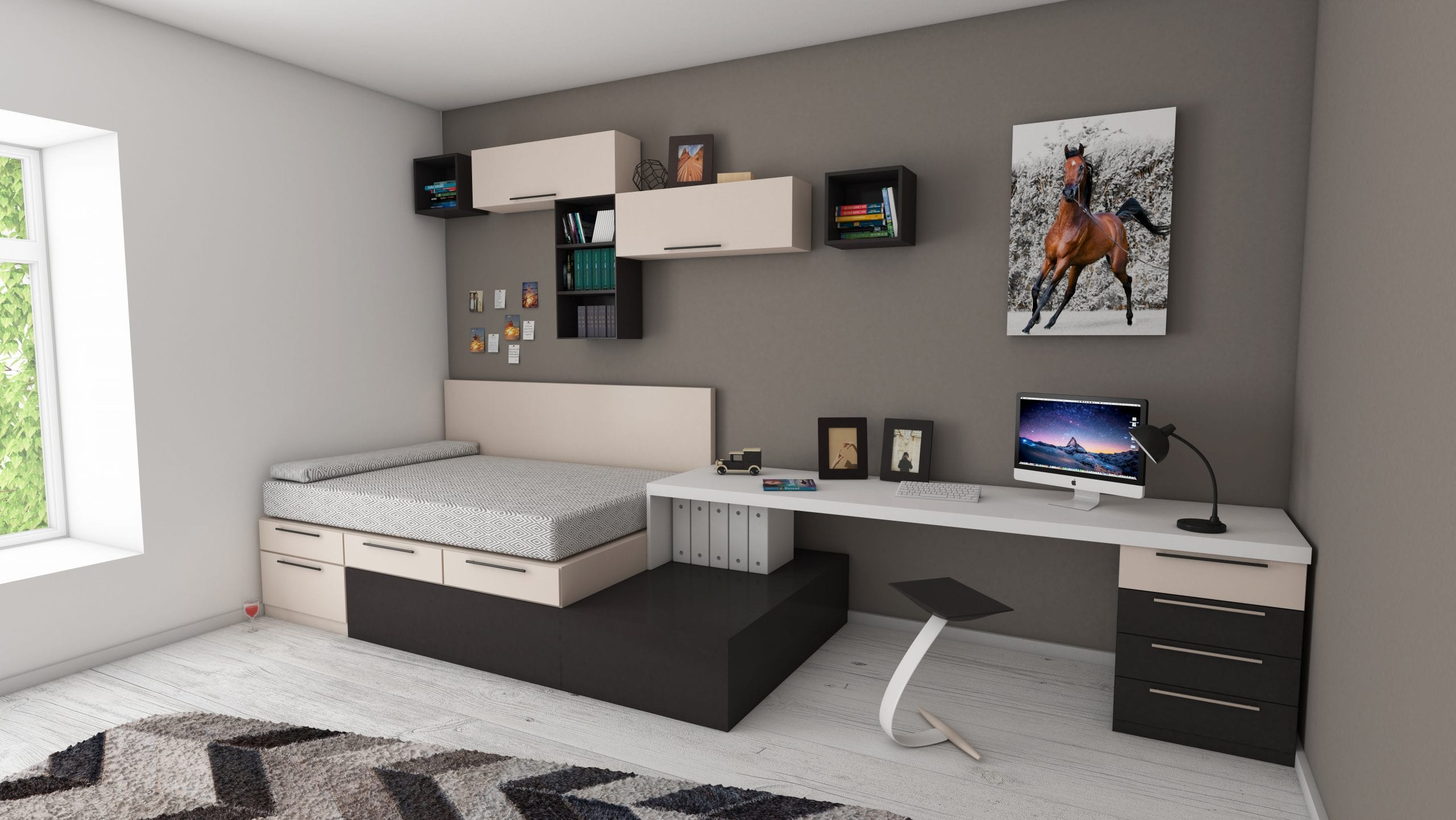
Teenage den designs may be the answer your family has been looking for! Are your kids grown up and their playroom unused these days? Looking a little worse for wear, perhaps? Hands up all those parents that keep falling over ever-longer teen legs in the living room!

Not that we want to keep our kids out of our living area, but they do need extra space, no matter what we think, so making them a personalised space that incorporates their interests and gives them an adult-free, private place to spend time is great for generational diplomacy, not to mention relaxing for all involved.

Don’t we call that a ‘bedroom’?

Well, sure, but not all bedrooms are created equally. Storage space, room for scientific experiments, music practice (and all that sheet music) and art space, can all be difficult to fit into a room that has a bed, a dresser, a wardrobe and goodness knows what else.

If a bedroom is all you have to work with, you can still split off part of it, and create a lounge environment within that. Some serious beanbags, a corner sofa, or even demarcating the floor with funky rugs or design, can give that ‘living room’ vibe, whilst still being firmly in the domain of the teenager.

Colour for teenagers

Many kids like bright colours and funky designs, despite the often common attraction to black. Thanks to vinyl decals and one-coat paint, you can deliver this requirement with a bit of parental pizzazz. Cover the walls in their favourite colour—or if that’s a little on the dark side, finish an accent wall in that shade, and something a little lighter for the rest.

Blackboard vinyl decals come in all kinds of shapes and sizes, or you can funk up a whole small alcove in blackboard paint, to encourage fun ideas, notes, and reminders. Vinyl can also be pretty! So birds, animals, plants, and other shapes and designs can be popped on the walls in appropriate places for additional visual interest and ahhh-factor.

Rugs don’t have to match the walls; you know your kid the best. Geometric designs with clashing colours could be the answer, or you may prefer to keep things pretty, or classic with a plain accent colour.

Short pile rugs with a rubber backing tend to be the most long-lived, not least because you can wash them down and quite often throw them in the washing machine if necessary.

Furniture

Wondering where you’re going to fit a desk or table in your teenager’s den? Why not run a heavy wooden bench along the length of the room on one side? That would give them plenty of room for seats, friends, creativity and of course, it can always be a dumping ground too.

Soft furnishings to provide them and their friends with comfortable places to lounge and watch TV are, of course, essential. How you go about that, though, depends on your kids’ tastes. Do they want a sofa? Or would they prefer a pile of beanbags in the corner? Beanbags and cushions tend to lose shape and filling over time, so well-stuffed ones are essential.

Cupboards and other storage space are also imperative; it’s impossible to tidy things away if there’s nowhere to keep them. However, you can get really creative with storage ideas. Cuboid modular shelving is all the rage at the moment, and it looks like a trend that is set to continue. Whatever your price range, there appears to be something you can get that does this. Whether you create something from scratch out of scaffolding boards, or simply buy in the modules you need, this shelving has purpose, as well as design, and that’s why it’s such a good investment.

Lighting

Lighting really will make a big difference to your teen’s den. Rather than assuming all they need is a powerful overhead light, you’ll find that layering the light within the room creates a sophisticated ambience that a teenager will enjoy. They aren’t bairns any more, and they do need to feel that they’re being taken seriously.

If you’ve got a large feature in the room, such as a table football game or a pool table, you may wish to hang a traditional pendant over it.

Any dark corners can be lit up with practical table lamps, or, if you think they’re likely to be knocked over and broken (again, you know your child), cunningly placed sconces or wall lights will give the same effect, without being placed at so much risk.

Coved LEDs can give a funky uplight to a special shelf of trophies or prized possessions, and for a really fun effect, colour change LED strips are really easy to install.

We know you want the best for your kids, and there’s nothing like fun, colourful, and comfortable surroundings to keep positivity and creativity flowing like it should. The Finished team loves the ideas we’ve been finding, so we hope your home and kids enjoy your own specially designed teenage den.


Where are you going to keep the remaining items? Find storage solutions through our Finished Directory and stick to the minimalist approach as you de-clutter your home.

Share This Article

WOULD YOU LIKE TO SEE YOUR HOUSE FEATURED ON FINISHED.IE?

Please click on the button bellow and fill the Featured House submission form.

No other phrase strikes fear into the heart of a hoarder like the suggestion that they should take the minimalist approach and de-clutter their home.

Words like ‘impossible’, ‘I don’t know how’, and *ARRRRRGHHHHH* are common utterances to the mild suggestion that a tidy-up may not quite cut it.

But what if there was an easy way?

What if … it didn’t pain you to lose all that stuff you didn’t need anyway?

What if?

Yes, well, the world doesn’t run on ‘what if’, so you’ll probably feel justified not doing so, but just in case the mood takes you, we’ve got some extra special ways you can use to de-clutter your home without pain.

Get into the Zen of de-cluttered, minimalist space

If you haven’t spent the last 20 years meditating, don’t worry, this one’s for beginners.
Sit with your stuff. In your room, cupboards, under the stairs, wherever. Pick things up and look at them, really look at them. Put them down again. Consider where you got each item from, if you really like it, and what it brings to your life right now.

If you can’t come up with something convincing in under 10 seconds for each item, then you probably don’t need that thing, no matter what it did for you once before.
If it’s memories you’re hoarding, well …sentimental value aside, have you got some other way to record it? Why not make a collage of photos of the different souvenirs you’ve picked up over your life.

Can you replace the item if you change your mind? Are you likely to change your mind about a three-legged pottery horse with one ear that your first boyfriend gave you when you were eight?

This isn’t an exercise in how mature you are. If you think you’ll regret the loss later, pop it in a ‘don’t know’ box for now, and move on, move on.

Hong Kong minimalism

Hong Kongers are renowned for their seasonal throw-out. Most people in Hong Kong live in tiny high-rise apartments, where storage space is often designed in the same innovative way as for caravans. When the new season’s clothes and furnishings come in, many Hong Kongers put out the last season’s gear. Thrift shops in the city are second to none.

The short time period that belongings are kept means that sentimentalism stays minimal … just like the size of your wardrobe.

There are downsides, of course. Who has the money to replace an entire wardrobe of clothes every three months? But there’s nothing stopping you selling it on eBay if you think you can make some cash back.

De-clutter, one piece at a time

This is a severely practical route to de-cluttering: take your time, do one piece at a time, don’t buckle, don’t falter, keep going until it’s done.

Sounds complicated, but it isn’t.

Take three black bags or cardboard boxes. Label one OUT, one KEEP, and one DON’T KNOW.

Enter the first room and take a long slow look around.

Now, lift the first item, decide if it’s going, staying, or if you’re not sure. Pop it in the relevant bag or box.

Be tough: if it has no use, if it’s broken, if you don’t even like the person who gave it to you, get shot of it.

Get rid of the ugly and useless

This one’s a special take on the one above: If it has a use, keep it. If it’s beautiful, keep it. Everything else can go.

That means it can’t be broken, useless, pointless, or childish.

Make de-cluttering a game

This type of thing really is a game to some folks.
The principles are the same, no matter what format you use.

One thing once a day

This should be pretty self-explanatory. Heave out one item you don’t want, don’t like, or don’t need, every single day for a month. It’s a slow process, but like losing weight, the slower you do it, the less likely you are to pile it all back on.

If you get to the end of your month and you still need to de-clutter, keep going. Better still, get shot of two things every day for that month.

Every month, increase by one the number of items you throw out daily.

Five items a day for a month

One thing goes out on the first of the month. Two things go out on the second. Three things on the third. You get the picture. Good luck with throwing out thirty-one items on the last day of the month. You’ll be able to get rid of hundreds of useless items in one month, but for some, this method might be a little too harsh.

One thing more every day

Five items every day doesn’t seem like too many, but if you multiply five by thirty-one, that’s 155 items in a month.

Everything goes into a box or a black bag, and is carted to the right place (the tip, the charity shop, or eBay) at the end of each week. Don’t leave it too long, or you’ll need to make room for increasing numbers of full black bags.

De-clutter twice as much every day for a week.

Chuck out one item on the Monday. Two on the Tuesday. Four on the Wednesday. Eight on the Thursday. Sixteen on the Friday. Thirty-two on the Saturday. If you’re up to the extra exertion, try sixty-four items on the Sunday.

Yeah, good luck with that.

A final word

Just one more thing about hoarding. Many of us do it, so much so that keeping things long past their true usefulness date could be considered to be part of the human condition. But why do we do it?

For many people their belongings, no matter how old, strange, or battered, represent part of them. Their lives, their experiences, and their Selves are all tied up in the possessions they drag about with them from one house to the next.

Without our things, we expect to feel bereft, or incomplete. We’re afraid to let go in case we lose something important in the process.

But the truth is, de-cluttering is empowering and freeing. It releases you to achieve greater and better things by providing you with space. If you’ve ever heard the phrase ‘tidy home, tidy mind’, and laughed hysterically at the thought of your home being ‘tidy’, think again. No-one would like having a heavy set of shackles around their ankles day in, day out, but energetically that’s what we’re doing when we pile up our old, knackered, and dusty possessions in our homes.

Minimalists aren’t just smug for no reason. They’re on top of the world because they’ve got so little weighing them down. Most of us would agree it would be very nice to live like that, so here’s your opportunity: take the minimalist approach to finish your living space—declutter your home.

Where are you going to keep the remaining items? Find storage solutions through our Finished Directory and stick to the minimalist approach as you de-clutter your home.

Share This Article

WOULD YOU LIKE TO SEE YOUR HOUSE FEATURED ON FINISHED.IE?

Please click on the button bellow and fill the Featured House submission form.

Look, we didn’t get you here on false pretences. We genuinely spent 6.5 hours researching UK home interior companies who ship free to Ireland. Ten—yes, TEN—Google pages and countless related searches later, we came to the conclusion that we, the Finishers, suffered this travesty, so that you didn’t have to.

So, below you’ll find an incredibly small collection of websites you can use to buy fantastic home interiors products from the UK, with free delivery to Ireland.

We found three. Three retailers that sell furniture, lighting, and accessories, and are prepared to ship them free of charge to Ireland.

However, we also found out quite a lot of information about how websites deliver to Ireland, so we thought we’d give you all the news, not just some of it, and there’s a neat workaround at the end, for those who have just about had enough of poor delivery arrangements from the UK to the EU (and yes, make no mistake, this is before Brexit).

Read on to discover our revelations!

Home interiors sites with free shipping to Ireland

Yes, these exist!


The White Company

Live it up with elegant home furnishings, from cushions to sofas; accessories for your dining room, living room, and kitchen, and even goodies to make you and your home smell great.
You can get the delivery information right here, but be assured the White Company offers free shipping to Ireland for all products, including furniture, as long as you spend over £50 (approx. €60).

Harrogate Interiors

Harrogate Interiors produces some rather unusual styles of furnishings and accessories for your home. You probably won’t see these anywhere else, and certainly not in your neighbour’s home./

What’s more, although their ‘international’ shipping arrangements seem a little vague, they do state: “But generally our standard shipping to your chosen port is free of charge.”

We’d suggest you check carefully with them about your order before making it, in case of disappointment. Despite the vagueness, we’re optimistic that this could be a good site to use, and their products are certainly worth a look.

Tylko Shelving

This crazy paving of shelving is completely customisable, and is all about filling the bits of space you have with interesting and useful shelves and cupboards. Everything clicks into place, so it’s technically no more complex than making a shelf out of Duplo®. But more elegant.

If you check out the shipping arrangements, they’re totally free.

Non-UK home interiors sites with more-or-less free shipping to Ireland


Hem

Hem is a smashing boutique website, with some completely gorgeous lighting, rugs, furniture, and accessories. They’re not cheap, but neither are their designs and fabrics. Their designers are based in Stockholm, Sweden, and their products are made by a variety of artisanal creators and small companies, right across Europe.
Hem ships free to Ireland, and indeed, right across Europe.

Scandinavian Design Center

Seriously, the Swedes have it all. From wibbly-wobbly stoneware for your dining room, to slick modern designs and luxurious fabrics, these guys are seriously aware of the nuances that make up modern design culture. /

The Scandinavian Design Center ships free to Ireland as long as you’ve spent €149. If you spend less than that, it’ll cost you €9. However, bear in mind they can’t ship furniture and other bulky items.

Mokee Nursery Furniture

Featured on Mumsnet and a variety of other parent-orientated sites, Mokee produces well-made furniture designed to be used and overused by your little monkeys (and then passed down and hopefully used by their little monkeys), and all at a price considered affordable. It’s not quite home furnishings, but is definitely something most families will need at some point!

Best of all, Mokee provides all EU delivery free of charge, including free shipping to Ireland.

Home interiors sites that ship to Ireland with under €10 delivery charge


Anthropologie

Anthropologie is a fantastic boutique site, with a lot of unusual stuff. From sofas and soft furnishings, to all the twiddly bits, it’s got that ‘reassuringly expensive’ feel to it, although you don’t have to spend a fortune if you choose carefully. We particularly like it for finishing touches.

They don’t ship free to Ireland, but their standard delivery takes only 3 to 5 working days to arrive, and costs only €5, which is a bargain really.

Tiffany Lighting Direct

Tiffany lamps may have a certain time period or taste associated with them, but as a brand style, they’ve developed and grown with the years. From the classic styles, to more modern takes on glass lampshades, Tiffany Lighting Direct has more than enough to choose from.

Again, Tiffany Lighting Direct does not ship free to Ireland, but it does only charge a £9 flat fee.

Big home brands already based in Ireland

Next, John Lewis, House of Fraser, and Debenhams are already all in Ireland, as you’ll be aware. But did you know, Next offers free next-day delivery to your home?

Debenhams is free on orders over €4.95, and House of Fraser gives free delivery on orders over £50 (and £3.95 for delivery on orders under £50). John Lewis brings up the rear with delivery costs “from €10.00”. Fees may be more for larger or more expensive items.

If you’re familiar with Harry Corry, for bedding and curtains, that site offers free delivery on orders over €60.

The workaround

It isn’t just that UK companies don’t offer FREE shipping to Ireland. It’s that many of them literally don’t ship to Ireland at all.

With that in mind, delivery companies with a bit more about them have set up virtual addresses within the UK to enable those in the Republic of Ireland to access shipping arrangements more easily.

Obviously, this service isn’t free. What’s more, it tends to cost more for larger items, so may be better for buying clothes and only home accessories, rather than sofas and tables. However, the option’s there, in case you’re beginning to feel desperate.
.


AddressPal

AddressPal only ships items that are less than 20kg, so large items are a no-no. You should check out their pricing and sizing guide to work out how much it would cost you. More awkward parcels could cost you €25 each, so this may not be a viable way to outsmart the delivery gremlins.

DPD Parcel Wizard

Again, it’s limited, but you can get deliveries under 31kg sent to your home via a DPD Parcel Wizard virtual address. It’ll cost €3.85 for the first 20kg, plus €10 per consignment, plus 72 cents per additional kg. The maths on their FAQs page looks complicated, but should enable you to work out if it will be worth the additional cost and effort.

So, this blog may not have finished off your shipping woes, but if you wanted to avoid hours of research going through 100+ listed pages and websites, we hope we helped you!

Shipping isn’t the only problem, but it’s often the biggest one, with costs spiralling out of control unless a company has a good relationship with a delivery company. Let us know if you find any more UK companies that ship free to Ireland!

Share This Article

WOULD YOU LIKE TO SEE YOUR HOUSE FEATURED ON FINISHED.IE?

Please click on the button bellow and fill the Featured House submission form.

Hall lighting solutions: possibly the difference between your home and a hotel. The hallway is often the first room visitors see as they enter your home, so although you want it to scream elegance (or possibly, utter the word gently, in a breathy tone), you don’t want it to seem too impersonal.

One of the ways to make its finish truly yours is to light it in a very personal way. However you choose to adorn the walls, you can highlight certain features—the odd picture, mounted sports gear of the past, a special vintage console table—with the right lighting and ambience.

Of course, you also need your hallway to be practical. If you have a mirror in there, you’ll need a light to illuminate your face for easy checking before opening the door.

If you have bookshelves and dressers that line the walls or sit behind the doorway, perhaps you could give them a special lighting treatment to lift them. Books, particularly, can really drag the place down energetically if you let them sit there in the dark and dust. Far better to show them off with some beautiful coved lighting, and make them a real feature.

We took a look at some of the lighting options out there for hallways, and it’s clear that the best tip of all is this:
Light your hallway in layers.
Wondering what that means? Keep reading.

Ceiling lights for hallways

Hallways, particularly in town houses, tend to have quite high ceilings, so if you’re looking for an easy enough practical solution, but you’d like a bit of class, you could finish it off with a set of wonderful pendant lamps.

Three or fewer (or more) spread evenly down the hallway can provide intriguing ambient light where the edges of each hotspot overlap a little. Thinking about the need for layers, it’s important there’s more than just one light source.  This way, the light can use hotspots and shadows for visual interest.

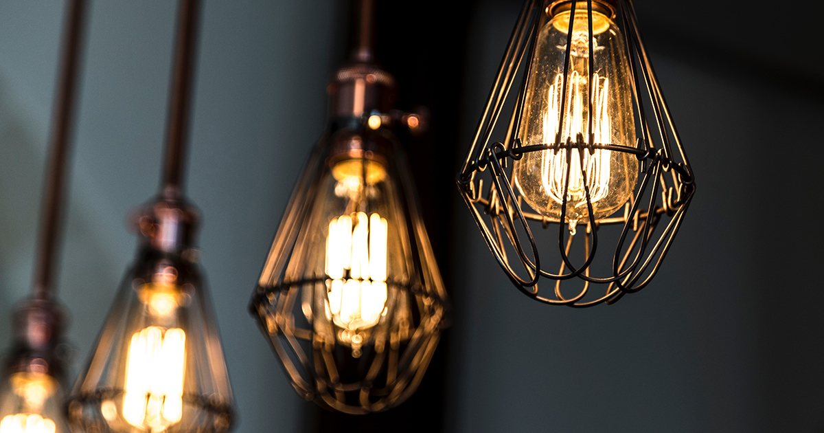
Pendants come as all kinds, so if your tastes run more towards the utilitarian or industrial look, there are many wire-based and metal pendant lamps that can really dig your style, as well as the classics.

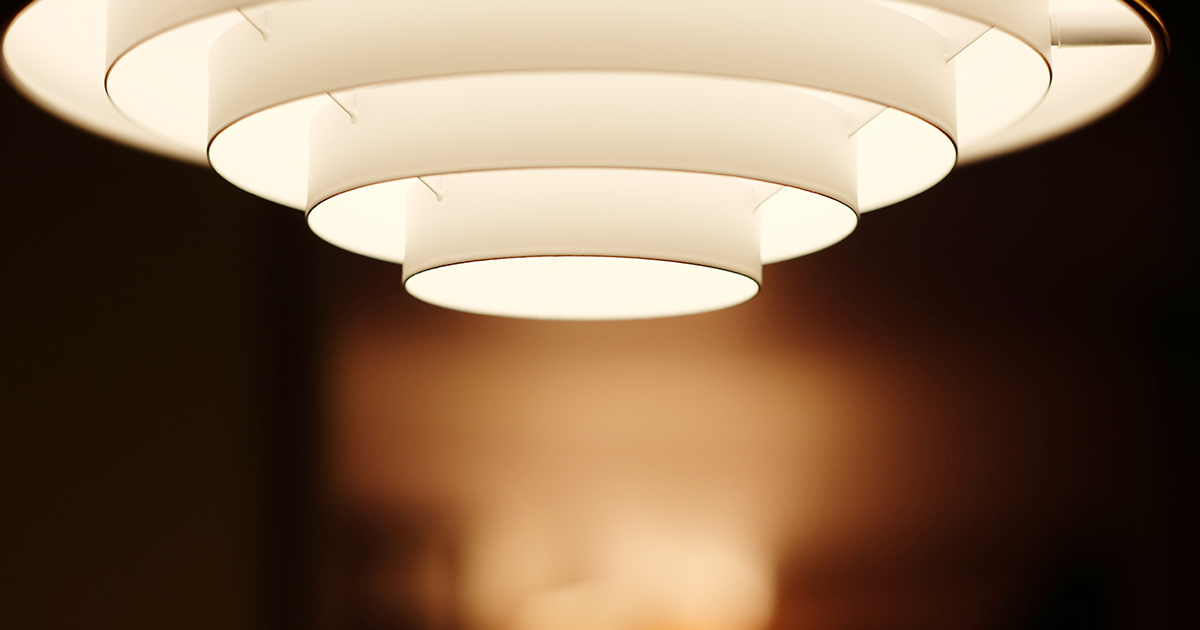
If you’re taller than the average person, you might prefer flush or semi flush lighting in your hall. These types of lamp enable you to fit them quite closely to the ceiling, so all the head space is available for the users of the hallway.

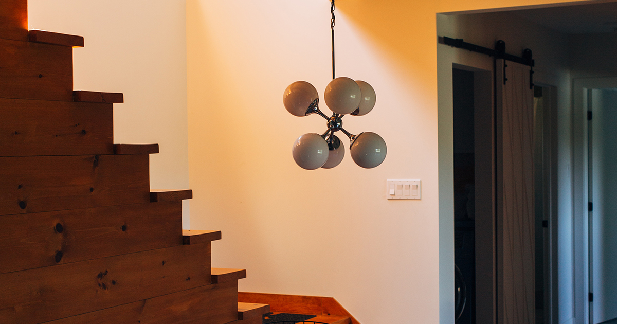
If you want to make a little statement—or a grand one—a single beautiful feature pendant in combination with very plain and discrete flush lights, can look very grand behind the door, at the foot of the stairs, or even on the first stair landing.

Again, we’re suggesting several lights here, not just the single pendant by itself. You need practicality in a hallway, so enough lighting is important, and the layered lighting thing can only work with several lights. The light from each lamp will surround the immediate area, so you should always place the next lamp or cluster just far enough away to create an overlap.

Wall lights in your hall

Wall lights don’t have to be boring. If you’re after something really useful on your hallway walls, try the adjustable arm type wall lights. These can look somewhat tough and industrial, but there are plenty of fancy ones too. In fact, what we’re finding is that much of the offer out there at present is aimed at a halfway point between industrial and elegant. For example, any of these types of glass-and-shine combination lamps could fit that description.

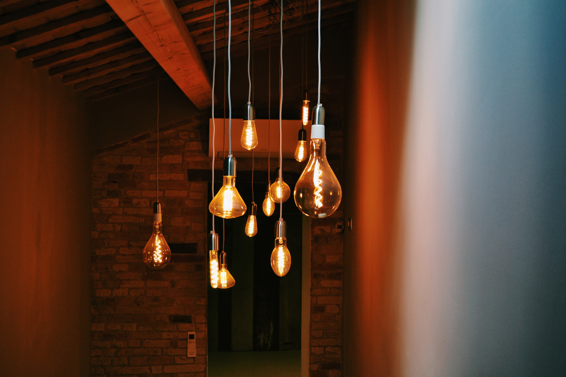
Those that look like naked Edison bulbs, with the filament as a feature, are totally on fleek at the present time. This style of light comes with a beautiful blown glass ‘bulb’ shade, and there’s a wide range of shapes on the market.

Again, layering the light means placing each lamp at the optimal distance from the last, ensuring there’s an overlap of light thrown, but allowing for dips, shadows, and a bit of textural darkness to create visual interest.

LED lighting for your features

LED lighting might seem like a right fiddly trick to pull off on home DIY, but in fact, it’s getting a lot easier now, especially with the sticky strips of LED bulbs that you can buy up to almost any length.

The trick to LED lighting, however, is to read up about the clever ways you can use it!

Some of the ones we know about include coved lighting that highlights either books or special ornaments on shelves. This can be a single colour, or if you’re a bit flashy, perhaps you’d prefer a colour change system, where the lights can happily cycle through the rainbow all day.

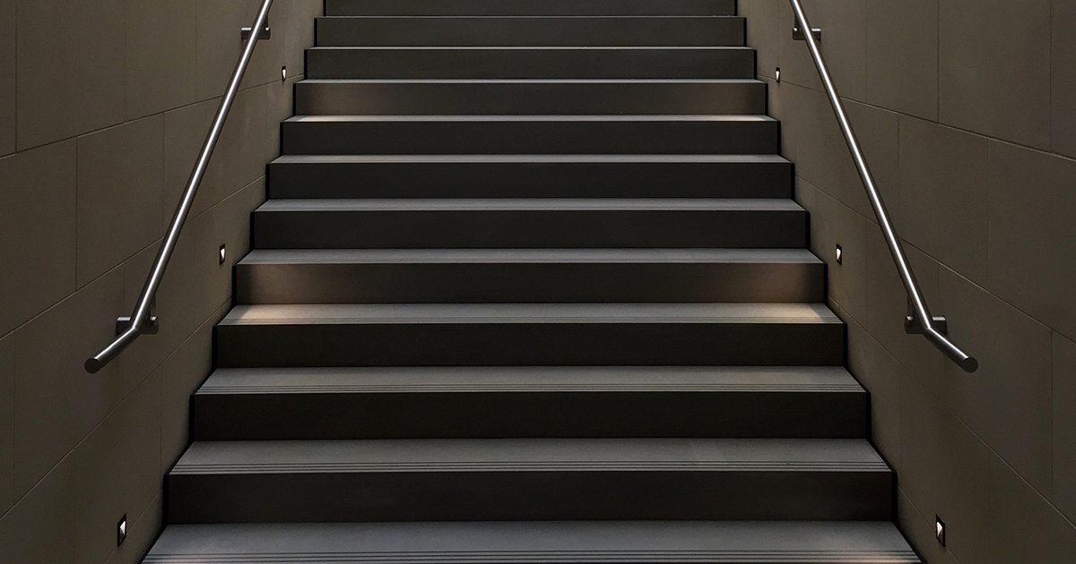
Another really effective way to use LED lighting is to help give a poky dark hallway a bit more context and space. If you’ve got the opportunity to create small alcoves for ornaments or special features, for example, in the wall or the side of your stairs, you can provide an extra dimension of space by back lighting the alcove. This makes the featured item inside the space stand out in a very elegant way, and the impression of more room is always good because no-one likes feeling claustrophobic, even if they are only in the hall for the time it takes them to put their coat on.

LED lights also work extremely well in the skirting board (also known as a base board). Here, they can illuminate the floor, provide general lighting that adds an extra layer to the lower area of the hall (more layer) and even create fantastic patterns and shapes for those who are particularly talented at their placement.

Whatever you choose to go with, it’s worth remembering that you can’t always find the best services online. For the best finish for your gorgeous hallway, you should always have a chat with a person in a dedicated local lighting shop—family-run shops like this are often fonts of knowledge. They’ll be able to advise on the sort of effects you can create in your hallway, and will be more likely to specially obtain the lamps you need for your hallway lighting solutions.

Share This Article

WOULD YOU LIKE TO SEE YOUR HOUSE FEATURED ON FINISHED.IE?

Please click on the button bellow and fill the Featured House submission form.

Industrial kitchen

What DIY-ers need to know about the industrial kitchen trend

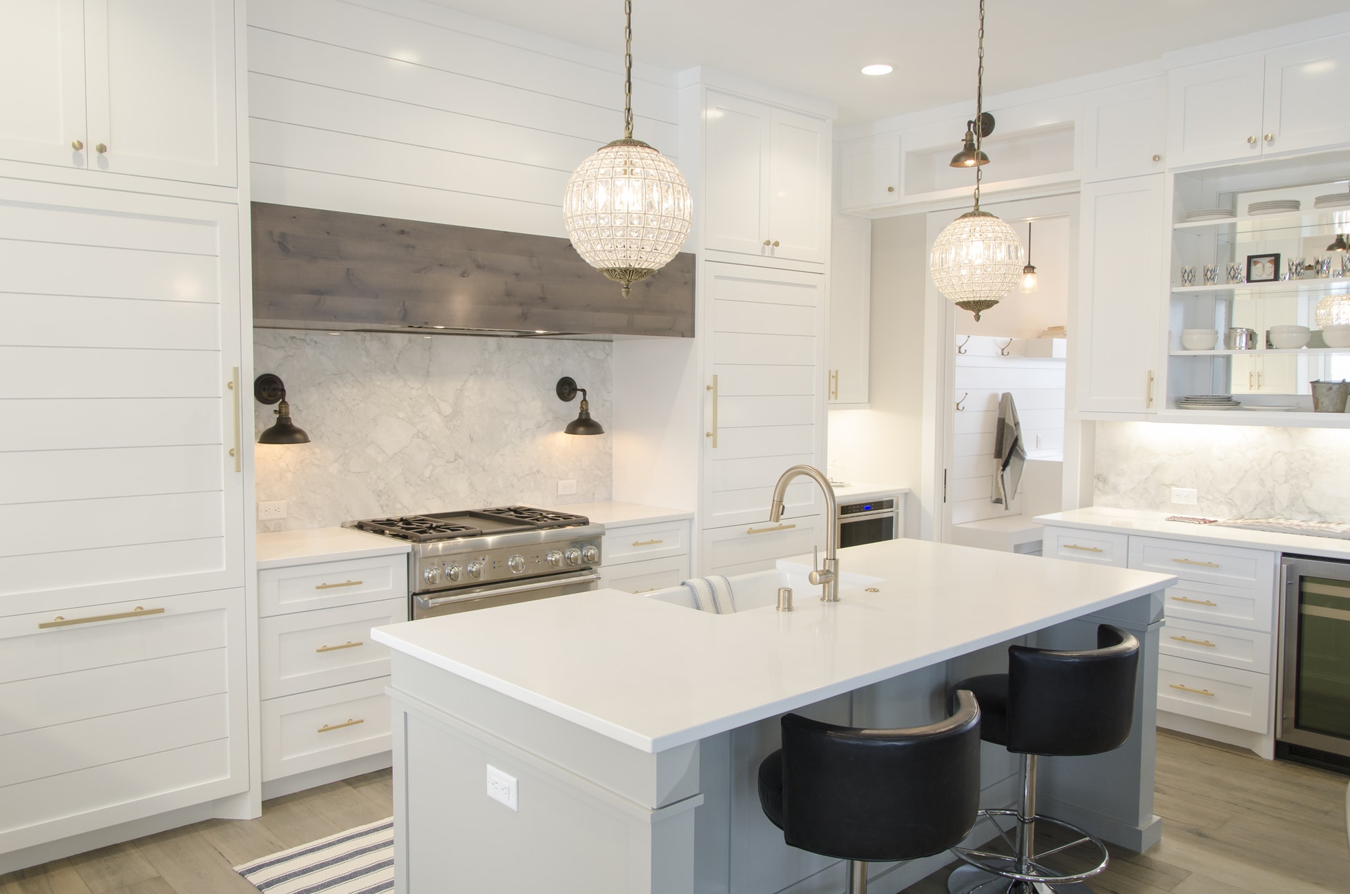
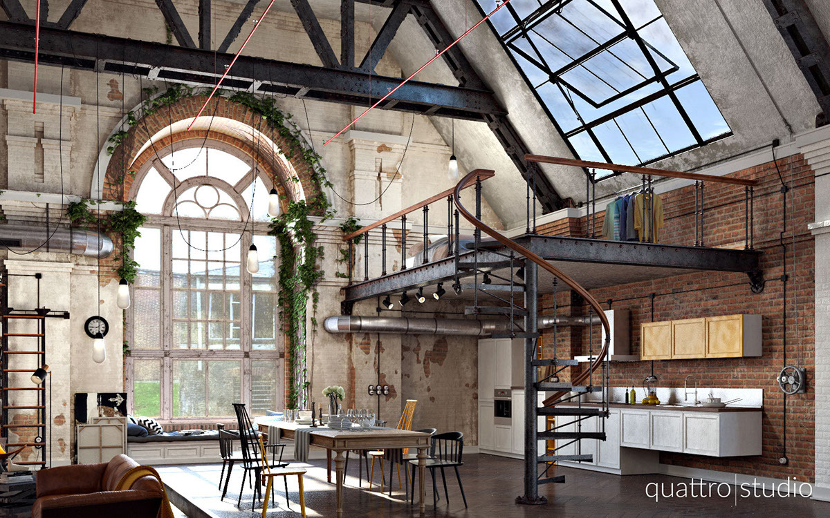
Unlikely to grow old quickly, the industrial kitchen trend carries with it long-lasting surfaces and finishes, stainless steel appliances, large clean spaces, and a strong feeling of hygiene and efficiency. Just what you want in a kitchen.

Rather than giving you some kind of prescriptive ‘recipe’ for the perfect industrial kitchen design, we thought you might find this list of considerations useful for creating your own unique version of this tried-and-tested design trend.

How much space do you have for your industrial kitchen design?

Space. It may still be the final frontier, but it’s also one of the first considerations when contemplating an industrial kitchen design.

Size matters, and the industrial kitchen trend relies on size for some of its effect. Many of the appliances are large, the island in the middle will take up more floor space than you think, and the almost-requisite pendant lamps need height to be effective.

One of the most common errors made by DIY-ers is to try to fit too much design into a space too small. With the industrial kitchen trend, proportion is nine-tenths of success.

To avoid problems with space, you could create a scale drawing of your kitchen using squared paper and a ruler. A bird’s eye view is usually the easiest to draw. You can then cut out cardboard shapes—also scaled—of the various fixtures and fittings you’re considering for your new kitchen. Fit them into the drawing and see if you really will have the space. You don’t want to have to squeeze past appliances, burn your hand on the hob when you turn on the tap, or have to close one cupboard to open another.

Scale drawings don’t help much with vertical space, but it’s safest to consider the design ‘rule of thirds’. For example, measure the height of your kitchen from wall to ceiling. Your work surfaces and your island (if you’re having one) need to be around one-third of the height of your kitchen.

910mm is a ‘standard’ height for kitchen surfaces, so for the best industrial kitchen trend design, you could loosely consider that your ceiling height should be no less than three metres.

What industrial materials do you want to incorporate?

Materials are the base of your design, literally the building blocks of your kitchen at a molecular level. We’ll state this now: chintz, frills, and bright coloured moulded plastics are not compatible with the industrial kitchen trend. Great. So what will work?

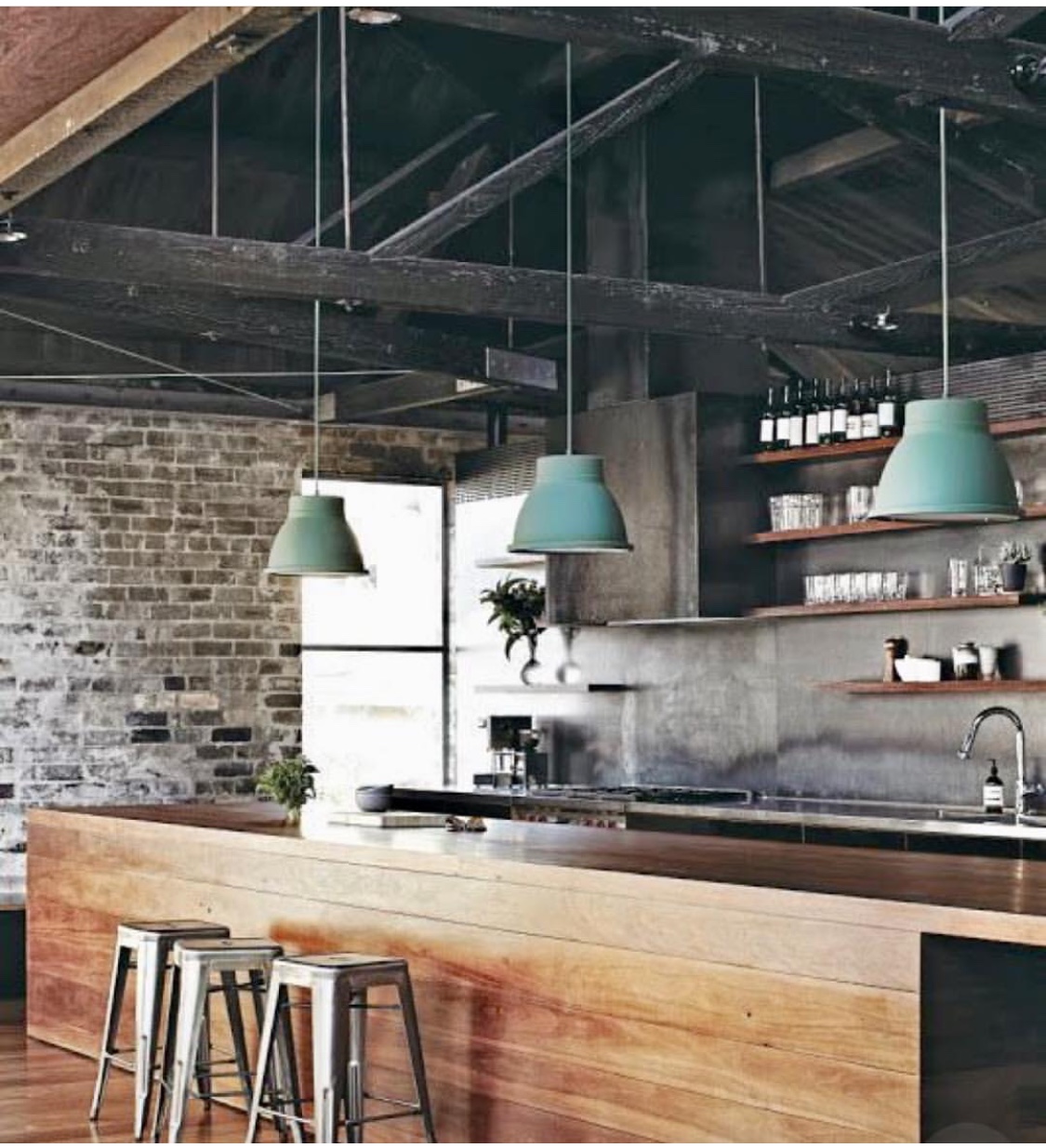
The main materials you’ll want to consider are those that emulate actual industrial design. We’re talking the sorts of tiles you get in a New York subway. Concrete flooring, or reclaimed wood boards, reminiscent of old factories or warehouses. Parquet flooring if you can. Exposed brick on walls, or even on features, such as a built-in breakfast bar, or the base of your island or peninsular.  Copper or antique brass fittings are highly recommended, especially for those who want to bring a vintage feel to their industrial kitchen, but stainless steel will also fit right in.

These under-appreciated materials provide the base of your kitchen’s atmosphere, with muted, understated colours, and an emphasis on the practical.

You can also change it up a little, without going overboard. For example, quartz counter tops may not be the latest thing in standard industrial design, but those little sparkles will give your space an uplift.

What fixtures and appliances are central to the industrial kitchen trend?

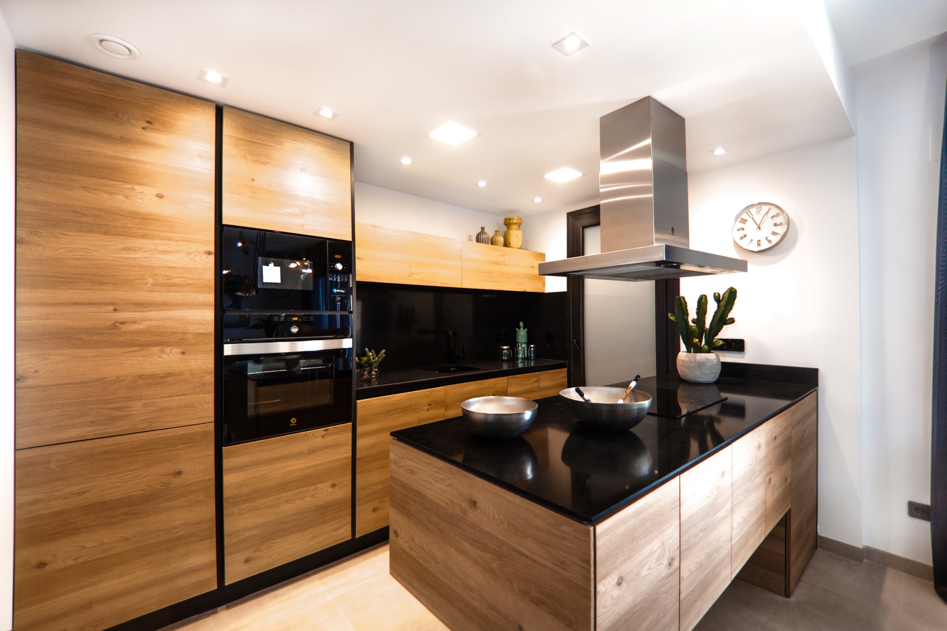
Seriously, what do you need in your kitchen? The sink rather goes without saying. Not to mention the fridge, freezer, dishwasher, wall oven, extractor fan, and hob.

But every kitchen has that, industrial kitchen trend or no, so what makes the difference here?

Our advice is to think bold. Pitch your game as high as you can afford. Stainless steel tends to be the name of the game when it comes to industrial kitchen appliances, but you don’t have to follow blindly. Brightly coloured, well-designed gadgets can work beautifully against the greys and browns of industry, acting as a smart accent of personality within the wider effect.

Splashbacks and surface savers—even counter tops can provide you with further opportunity to engage with your inner child,  and choices—all as valid as each other—range from bright primary colours to mirrored steel.

And don’t forget, detail is everything when it comes to design. Whatever your unique fittings in your kitchen space, take a step back and try to consider how it will look in your new industrial kitchen. Big, angular, shiny, practical, all of these are great ways to describe industrial designs. If your new fitting or appliance isn’t one of these things , you might want to reconsider for the sake of a congruent design.

What colour schemes do you fancy?

As mentioned under materials, colour schemes for industrial kitchens tend towards the muted, more base colours for the majority of the space. Blacks, browns, grey, terracotta (brick red), steel, none of these would be out of place in an industrial kitchen.

But a kitchen that only incorporates these backdrop colours may fade in the memory of visitors, without the occasional splash of an accent colour to break it up.

One of the ways in which you can match up accent colours to the overall scheme is to create mood boards. These can be done physically, with a large piece of backing card and lots of pictures and colours from various sources, or you can create a virtual one in an app like Pinterest.

Think about how the colour scheme makes you feel, whether it’s a bit depressing, or if it’s too bright and funky. You’re looking at moods, not details, but this is important, because you’ll use the kitchen every day. It has to reflect what you want it to.

Dark kitchens are very much in vogue at the time of writing, and these may not necessarily disappear over night. However, you might have an even greater need for an accent colour or for white, if you choose a dark scheme overall.

What lighting will be the most useful and attractive?

Dark or light, your kitchen will need to be lit. There’s an array of industrial lighting that has been tailored to the domestic market, with minimalist designs that just … well, work.

The ubiquitous pendant lamp is often one of the main features in any industrial kitchen design, thanks to the rise of the kitchen island. Hanging almost directly from the ceiling, three pendants in a row, or one large one, could work just as well, depending on how much air space you have in the room.

Your other features will help you choose the materials for the casing of the lamps. Polished nickel, stainless steel, copper, and even matt black are all respectable members of the lighting palette.

However, pendants aren’t for everyone, not least the fact that they work best from a properly high ceiling.

For this reason, you might also want to think around spot lights, wall sconces, and artfully arranged under-cupboard LED lighting, to ensure your working space is as well-lit as possible.

Don’t forget natural lighting! The sunlight that hits your kitchen space can be invited in through large steel-framed windows, skylights, and cunningly placed portholes, and is—hands down—the best light to work with in any capacity.

All these things and much, much more, are central to creating the right design for your kitchen before you put any of it into practice. The bigger you think, the more costly the mistakes can be without careful planning, so while winging it may seem attractive, you’re more likely to finish successfully if you pay attention to what has already been said about the industrial kitchen trend.
Still need some ideas? Check out our directory for more ideas that work with the industrial kitchen trend.

Share This Article

WOULD YOU LIKE TO SEE YOUR HOUSE FEATURED ON FINISHED.IE?

Please click on the button bellow and fill the Featured House submission form.

Industrial kitchen

What DIY-ers need to know about the industrial kitchen trend

Unlikely to grow old quickly, the industrial kitchen trend carries with it long-lasting surfaces and finishes, stainless steel appliances, large clean spaces, and a strong feeling of hygiene and efficiency. Just what you want in a kitchen.

Rather than giving you some kind of prescriptive ‘recipe’ for the perfect industrial kitchen design, we thought you might find this list of considerations useful for creating your own unique version of this tried-and-tested design trend.

How much space do you have for your industrial kitchen design?

Space. It may still be the final frontier, but it’s also one of the first considerations when contemplating an industrial kitchen design.

Size matters, and the industrial kitchen trend relies on size for some of its effect. Many of the appliances are large, the island in the middle will take up more floor space than you think, and the almost-requisite pendant lamps need height to be effective.

One of the most common errors made by DIY-ers is to try to fit too much design into a space too small. With the industrial kitchen trend, proportion is nine-tenths of success.

To avoid problems with space, you could create a scale drawing of your kitchen using squared paper and a ruler. A bird’s eye view is usually the easiest to draw. You can then cut out cardboard shapes—also scaled—of the various fixtures and fittings you’re considering for your new kitchen. Fit them into the drawing and see if you really will have the space. You don’t want to have to squeeze past appliances, burn your hand on the hob when you turn on the tap, or have to close one cupboard to open another.

Scale drawings don’t help much with vertical space, but it’s safest to consider the design ‘rule of thirds’. For example, measure the height of your kitchen from wall to ceiling. Your work surfaces and your island (if you’re having one) need to be around one-third of the height of your kitchen.

910mm is a ‘standard’ height for kitchen surfaces, so for the best industrial kitchen trend design, you could loosely consider that your ceiling height should be no less than three metres.

What industrial materials do you want to incorporate?

Materials are the base of your design, literally the building blocks of your kitchen at a molecular level. We’ll state this now: chintz, frills, and bright coloured moulded plastics are not compatible with the industrial kitchen trend. Great. So what will work?

The main materials you’ll want to consider are those that emulate actual industrial design. We’re talking the sorts of tiles you get in a New York subway. Concrete flooring, or reclaimed wood boards, reminiscent of old factories or warehouses. Parquet flooring if you can. Exposed brick on walls, or even on features, such as a built-in breakfast bar, or the base of your island or peninsular.  Copper or antique brass fittings are highly recommended, especially for those who want to bring a vintage feel to their industrial kitchen, but stainless steel will also fit right in.

These under-appreciated materials provide the base of your kitchen’s atmosphere, with muted, understated colours, and an emphasis on the practical.

You can also change it up a little, without going overboard. For example, quartz counter tops may not be the latest thing in standard industrial design, but those little sparkles will give your space an uplift.

What fixtures and appliances are central to the industrial kitchen trend?

Seriously, what do you need in your kitchen? The sink rather goes without saying. Not to mention the fridge, freezer, dishwasher, wall oven, extractor fan, and hob.

But every kitchen has that, industrial kitchen trend or no, so what makes the difference here?

Our advice is to think bold. Pitch your game as high as you can afford. Stainless steel tends to be the name of the game when it comes to industrial kitchen appliances, but you don’t have to follow blindly. Brightly coloured, well-designed gadgets can work beautifully against the greys and browns of industry, acting as a smart accent of personality within the wider effect.

Splashbacks and surface savers—even counter tops can provide you with further opportunity to engage with your inner child,  and choices—all as valid as each other—range from bright primary colours to mirrored steel.

And don’t forget, detail is everything when it comes to design. Whatever your unique fittings in your kitchen space, take a step back and try to consider how it will look in your new industrial kitchen. Big, angular, shiny, practical, all of these are great ways to describe industrial designs. If your new fitting or appliance isn’t one of these things , you might want to reconsider for the sake of a congruent design.

What colour schemes do you fancy?

As mentioned under materials, colour schemes for industrial kitchens tend towards the muted, more base colours for the majority of the space. Blacks, browns, grey, terracotta (brick red), steel, none of these would be out of place in an industrial kitchen.

But a kitchen that only incorporates these backdrop colours may fade in the memory of visitors, without the occasional splash of an accent colour to break it up.

One of the ways in which you can match up accent colours to the overall scheme is to create mood boards. These can be done physically, with a large piece of backing card and lots of pictures and colours from various sources, or you can create a virtual one in an app like Pinterest.

Think about how the colour scheme makes you feel, whether it’s a bit depressing, or if it’s too bright and funky. You’re looking at moods, not details, but this is important, because you’ll use the kitchen every day. It has to reflect what you want it to.

Dark kitchens are very much in vogue at the time of writing, and these may not necessarily disappear over night. However, you might have an even greater need for an accent colour or for white, if you choose a dark scheme overall.

What lighting will be the most useful and attractive?

Dark or light, your kitchen will need to be lit. There’s an array of industrial lighting that has been tailored to the domestic market, with minimalist designs that just … well, work.

The ubiquitous pendant lamp is often one of the main features in any industrial kitchen design, thanks to the rise of the kitchen island. Hanging almost directly from the ceiling, three pendants in a row, or one large one, could work just as well, depending on how much air space you have in the room.

Your other features will help you choose the materials for the casing of the lamps. Polished nickel, stainless steel, copper, and even matt black are all respectable members of the lighting palette.

However, pendants aren’t for everyone, not least the fact that they work best from a properly high ceiling.

For this reason, you might also want to think around spot lights, wall sconces, and artfully arranged under-cupboard LED lighting, to ensure your working space is as well-lit as possible.

Don’t forget natural lighting! The sunlight that hits your kitchen space can be invited in through large steel-framed windows, skylights, and cunningly placed portholes, and is—hands down—the best light to work with in any capacity.

All these things and much, much more, are central to creating the right design for your kitchen before you put any of it into practice. The bigger you think, the more costly the mistakes can be without careful planning, so while winging it may seem attractive, you’re more likely to finish successfully if you pay attention to what has already been said about the industrial kitchen trend.

Still need some ideas? Check out our directory for more ideas that work with the industrial kitchen trend.
Share This Article

WOULD YOU LIKE TO SEE YOUR HOUSE FEATURED ON FINISHED.IE?

Please click on the button bellow and fill the Featured House submission form.

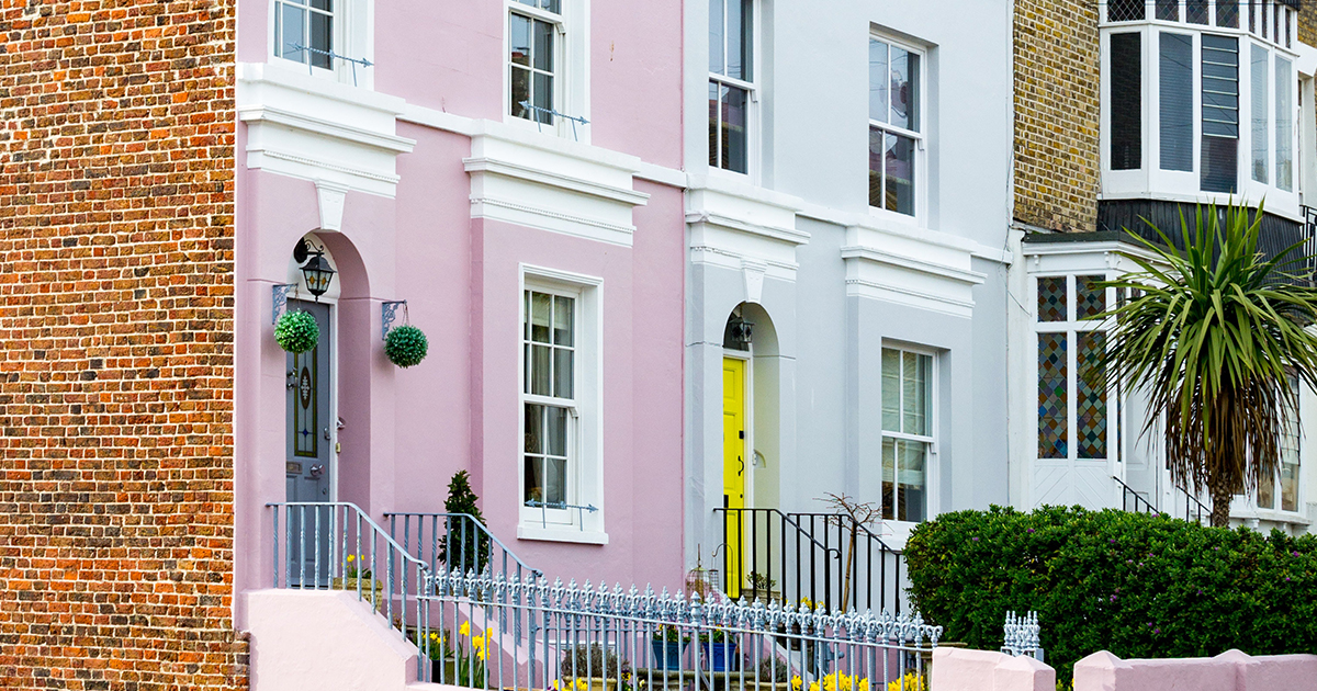
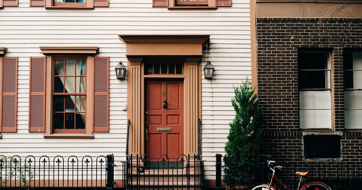
Outdoor paint colours – a big decision, so how do you choose?

Outdoor paint colours are a big decision, not least because the entire world can see the design choices you made … and they can judge, if they want.

So how do you get the right finish for your home, budget, neighborhood, and taste? Not to mention all the different brands of paint.

We’ve come up with a few ‘broad brush’ (sorry!) ideas to guide you, so we truly hope this helps!

Full make over?

It isn’t just the coastal regions that have full masonry paint jobs. Older homes, farmhouses, in fact, anything sat out against the elements, has traditionally needed additional protection from the weather.

If your home was previously painted, and it’s now in need of a new layer of love, you don’t have to feel obliged to use the same shade of colour, as long as there are no planning or historical requirements around this in your immediate area.

But how do you make the choice? Can powder blue ever be right? Or sunshine yellow?

Spot the elements

Certain things around your home’s exterior will likely stay the same for years. Even decades. For example, the steps leading up to the front door; the roof on the house – and even on an attached garage or shed; the general tones of the stone or brick of your area. Take a look at them quite closely. Take photos so you can peer at them later.

Consider how strong or bold the natural colours are. Ask yourself if they’re warm (red brick, hints of pink sandstone) or cool (blue slate, limestone), and consider palettes accordingly. We like to think we’re harmonising the colours when we work with a palette, but the truth is, all palettes need both harmony and complementary colours for the full designer effect.

Make three choices

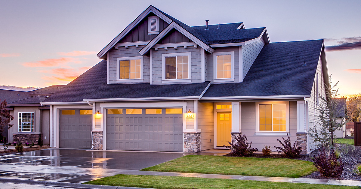
Three colours is probably as much as anyone needs, and if you’re not painting the masonry, you’ll probably only need two. You don’t want your home to be known locally as the Patchwork House, so it’s safe to say the design mantra ‘less is more’ does apply to exterior paint in most cases.

Main colour

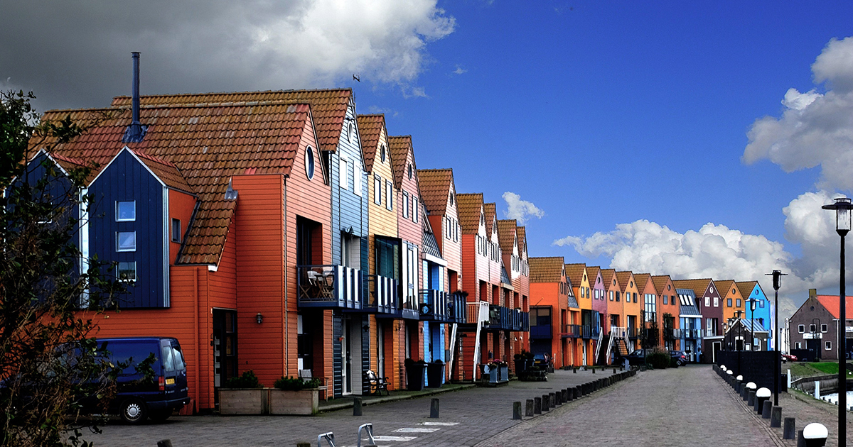
Take a good look at all the other houses on your street, especially if they are the same or similar style to yours. You don’t have to pick the same colours, but the general effect will be better if yours blends gently in without standing out too much. (The trick is not letting it stand out for the wrong reasons).

Think about the tones (blues, greens, creams) rather than the specific colours (cornflower blue, moss green). Instead of trying to match the colour, can you find something unique for your street in the same tonal bracket?

Lighter shades on masonry tend to make a building look more roomy, and their effectiveness can’t be ignored, which is why they’re often tonal ‘classics’. Natural shades, such as pale greens, greys, white and cream tones, all of these can be modernised with the right accent and trim.

If you have an old house, find out what colours it was traditionally painted. Again, you don’t have to go with something exactly the same, but an updated version of the colour it was painted when newly built would freshen it up and make it look very ‘right’.
If you prefer to go for holiday colours, again, erring on light-but-bright shades can work really well, for a well-kept but fun look to the place.

Accent colour

The accent colour does the same job on the outside of your home as it does on the inside: it highlights smaller, fancy bits of design, like the shutters, the doors, and creates a very pleasing, almost balanced effect. For this reason, many people prefer to use a bold or bright colour against an otherwise muted or classic tonal arrangement.

Complementary colours are those that are opposite from each other on the colour wheel. Most importantly, they tend to look very pleasing when brought together in a thoughtful way: purple and green, blue and orange, teal and puce. Sounds garish, and it would be if you made everything half and half, but because you’re only using one of the colours in a minimal way, the result is a home that people want to look at.

What’s more, it doesn’t have to be bright purple and bright green to work (best not, really). You can use a bold colour on the accent, against a more muted classic main colour, to give your home a designed-but-unpretentious attitude.

Trim

Trim is anything left over; usually the woodwork, including window frames, door frame, wooden trim under the roof, that kind of thing. It tends to make the place look cared for. More … finished.

Trim should be a bold contrast from the main colour, but rather than the complementary look, should be found within the range of tones that your main colour came from. A good example is that classic moss green as a main colour, paired with cream or off white as a trim.
You could, however, go dark too. It depends on your choice of accent colour, and how light your main colour is. With a dark or bold main colour, a lighter trim would be a more obvious choice.

Whatever you decide, think as big as you dare, and stand by your finishing choices. It isn’t as though you went to the paint shop blindfolded and just grabbed the first pots you saw. Outdoor paint colours are a big decision, but if it looks great and you love it, it’s yours to make.

Share This Article

WOULD YOU LIKE TO SEE YOUR HOUSE FEATURED ON FINISHED.IE?

Please click on the button bellow and fill the Featured House submission form.